
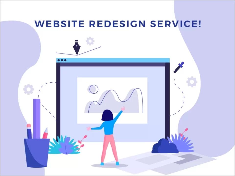
7 Reasons Why Responsive Web Design is Important in 2024
The days of a single, one-size-fits-all website are over. The rise of smartphones, tablets, smartwatches and other connected devices has led to an explosion in the number of devices that people use to access the internet. As a result, it’s becoming increasingly important for businesses to have websites that can be easily viewed on all devices—and responsive web design is here to help.
1. Responsive Web Design is Mobile First
Responsive Web Design is a technique that allows websites to be displayed properly on all devices, from desktop computers to tablets and smartphones. This means that you can create one website instead of having to create separate versions for different screen sizes.
Responsive Web Design has been around since 2010 when Ethan Marcotte wrote an article about it on A List Apart called “Responsive Web Design.” In the article he talks about how responsive web design differs from other techniques such as adaptive or mobile-friendly sites, which do not use RWD techniques.
2. Responsive Web Design Puts The User Experience First
The user experience is the most important part of a website, and responsive web design puts it first. A responsive website is more accessible and usable for people with disabilities, because it can be accessed from any device (including mobile devices), at any time and in any place–even if there’s no internet connection!
Responsive websites are faster to load than non-responsive ones, which makes them easier to use on smartphones or tablets. They also give you more flexibility when designing pages: one layout fits all screen sizes!
3. Responsive Web Design Makes Websites Work On All Devices Without Compromise
Responsive web design makes websites work on all devices without compromise.
Responsive web design allows you to build a website once and have it work on any device, whether it be desktop, laptop, tablet or mobile phone. With responsive web design, you can build a website that works on any device in any situation for your audience.
4. Responsive Web Design is a Good Way To Optimise The User Experience With No Extra Effort
Responsive web design is a good way to optimise the user experience with no extra effort.
The user experience is the most important part of any website, and it’s something you want to focus on as much as possible if you want your site to succeed. But even though many designers know this fact, not all of them are doing everything they can to make sure their sites are optimised for mobile devices–and that means there are plenty who could be missing out on opportunities for better conversions or traffic from mobile users!
Responsive web design is an easy solution for this problem because it allows you to create one website that works across all devices without having any technical knowledge (or coding skills).
5. Responsive Web Design is Essential For Any Business To Stay Connected
Having a responsive website is essential for any business to stay connected with their customers.
A responsive website is easier to use, and can be used on any device.
A responsive website is easier to maintain. You don’t have to create different versions of your site for different devices, so you’ll save time and money on maintaining it in the long run!
Responsive web design allows you to update content easily – no matter where the user is viewing from!
6. Responsive Web Design Enables Better SEO Performance
One of the most important factors to consider when building a website is SEO. Search engine optimisation (SEO) allows you to get more traffic from search engines like Google, Bing and Yahoo by improving how well your website ranks in search results. Responsive web design can help with your SEO performance because it improves how easily search engines can index and crawl your content. This means that people searching for information related to your business will be able to find it more easily when they use their mobile devices instead of desktop computers.
If you want better rankings on Google searches, then responsive web design is definitely something worth looking into!

7. Responsive Websites are The Future of The Internet and Digital Marketing as a Whole
A responsive website is the future of the internet and digital marketing as a whole.
The internet is becoming more mobile, and responsive design will be the future of websites in 2023. If you want to be prepared for this trend, then it’s time to start thinking about how you can optimise your website for mobile users now.
Responsive websites are easier to build than non-responsive ones, which means that there’s no extra effort required from developers or designers when building one out–and they also provide an optimised user experience on any device without being compromised by poor design choices (like forcing users into scroll bars).
A responsive website is easier to build, and can be used on any device without being compromised
Responsive web design is easier to build, and can be used on any device without being compromised.
Responsive Web Design is the practice of creating a single website that will adapt to any screen size. It’s more than just making sure your website looks good on mobile devices: RWD optimises the user experience with no extra effort.
Conclusion
There are many reasons why responsive web design is important in 2023. It makes your website work on all devices without compromise, it optimises the user experience with no extra effort and it enables better SEO performance. These are just some of the many benefits that come with building a responsive website today.
Frequently Asked Questions
What is responsive web design?
Responsive web design is an approach to designing and developing websites that aims to provide optimal viewing and interaction experiences across a wide range of devices and screen sizes. It involves creating a website layout that adapts and adjusts its content dynamically to suit different devices, such as desktop computers, laptops, tablets, and smartphones.
Why is responsive web design important in 2023?
Responsive web design is important in 2023 for several reasons:
A responsive website enhances user experience by ensuring that visitors can easily navigate, read, and interact with the content regardless of the device they are using.
It improves search engine optimisation as search engines prioritise mobile-friendly websites in their rankings, thereby increasing visibility and potential traffic.
Responsive design future-proofs your website, making it adaptable to emerging devices and technologies that may become popular in 2023 and beyond.
It helps businesses reach a wider audience by catering to the increasing number of users accessing the internet through mobile devices.
Responsive websites provide a consistent brand experience, maintaining the look and feel of your website across different devices and screen sizes.
How does responsive web design work?
Responsive web design employs a combination of flexible grids, fluid layouts, and media queries to create a website that automatically adjusts its layout and content based on the screen size of the device being used. It uses CSS (Cascading Style Sheets) to define how elements on the page should appear at different screen widths, ensuring an optimal user experience.
What are the benefits of responsive web design?
Responsive web design offers several benefits:
Improved user experience: Responsive websites provide a seamless browsing experience across devices, eliminating the need for users to zoom in or scroll horisontally.
Better SEO performance: Search engines prioritise mobile-friendly websites, leading to higher rankings in search results and increased organic traffic.
Cost-effectiveness: Rather than developing separate websites for different devices, responsive design allows for a single website that adapts to various screen sizes, reducing development and maintenance costs.
Time-efficiency: Managing and updating a single website is more efficient than maintaining multiple versions for different devices, saving time and effort.
Increased conversion rates: A responsive design ensures that your website is accessible and visually appealing on all devices, leading to higher engagement and improved conversion rates.
How can I make my website responsive?
To make your website responsive, you can follow these steps:
Start with a mobile-first approach, designing your website for smaller screens and then gradually enhancing it for larger ones.
Utilise responsive frameworks or templates that provide pre-built responsive layouts, grids, and components.
Use fluid grids and relative units (e.g., percentages) instead of fixed pixel values for layout elements, allowing them to scale proportionally.
Apply media queries in CSS to define different styles and layouts based on screen sizes, ensuring optimal presentation on various devices.
Optimise images and media for different resolutions and devices, using techniques like responsive images and CSS media queries.
Test your website on multiple devices and screen sizes to identify and fix any issues, ensuring a consistent experience across the board.