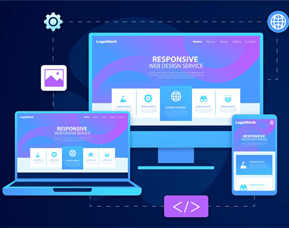
Get Mobile Friendly Responsive Web Design Sydney
Responsive Web Design: Focus on creating websites that adapt to various screen sizes and devices.
Optimal User Experience: Ensuring that users have a seamless experience regardless of the device they use.
Automatic Adjustment: The layout and content of the website adjust dynamically to fit the screen size.
Device Compatibility: Works well on laptops, desktops, tablets, and mobile phones.
Based in Sydney, we are a passionate Website Agency Sydney that creates stunning, user-friendly websites. Your site seamlessly adapts to provide an exceptional experience to visitors. But we don’t stop at building websites. We create success stories. Let us transform your online presence and elevate your brand.
Here’s what makes us different:
- Custom-made solutions: We tailor our approach to your specific business goals, ensuring your website perfectly reflects your brand and drives results.
- Advanced expertise: Our team stays on top of the latest technologies and trends to create websites that are not only stunning but also high-performing.
- Responsive design: We prioritise responsive web design sydney so your website automatically adjusts to different screen sizes, giving users an optimal experience on any device. For expert Website Designers Sydney services
- Dedicated support: We offer ongoing support and maintenance to keep your website running smoothly and securely.
Our Responsive Web Design Sydney Services
Mobile friendly design
Unlock the potential of mobile with our responsive web design sydney. We ensures your website not only looks stunning but also functions flawlessly on smartphones and tablets. Embrace the mobile-first approach, enhance user experiences, and drive conversions with a touch of our expertise.
CSS media queries
Enhance your website's adaptability with CSS media queries. We implement precise code to make your responsive web design sydney. Our CSS media queries ensure content optimisation for diverse screens, delivering an exceptional user experience. Stay ahead of the curve with websites that look stunning on every device.
Fluid grids
Crafting digital harmony through fluid grids is our expertise. We create websites that adapt gracefully to any screen size. Our fluid grid designs ensure a consistent, visually pleasing experience, whether on a desktop, tablet, or smartphone. Seamlessly engage your audience across all platforms.
SEO optimisation
Boost your online visibility with our SEO optimisation services in Sydey. We refine your website so search engines like Google can easily find and recommend it to people looking for what you offer. We help you climb the search result ladder and stand out in the digital crowd.
Flexible images and media
Unlock e-commerce success with our user-friendly shopping carts. Seamlessly integrate product listings, secure payment options, and attractive designs for an engaging online store.
Website speed optimisation
Experience blazing-fast websites with our speed optimisation service. We tweak every part of your site to load quickly, keeping visitors engaged and satisfied. Our optimisation magic ensures your website zooms past the competition, delivering a seamless and lightning-fast user experience.
The platforms we optimise
E-commerce Websites
Robust online stores with secure payment options, designed to drive sales and grow your digital business.
WordPress Websites
Versatile, user-friendly content management system (CMS) for easy content updates and website management.
2
Shopify Websites
Tailored ecommerce Sol with a focus on user-friendly product management, shopping carts, and payment processing.
3
Why Choose Us for Your Responsive Web Design Sydney?
- Experienced industry partner focused on achieving your business objectives.
- Approach based on understanding your unique goals.
- Commitment to transparent and honest practices, ensuring real value for your business.
- Data-driven decision-making and continuous refinement to keep your website evolving. For professional Website Creation Sydney services.
- Respect for your time with realistic deadlines and on-time delivery, keeping your project on track for success.
- Personalised attention and dedicated support throughout the project lifecycle.
- Proven track record of delivering exceptional results for our clients.

Responsive Web Design FAQs
Responsive web design and adaptive web design are two methods used to make sure websites look good on different devices.
Responsive design changes the layout based on the screen size using fluid grids and CSS media queries. It's like having a single template that adjusts itself to fit any device, making it easier for search engines to understand and rank your site for various screen sizes.
Adaptive design, on the other hand, creates specific layouts for different devices. Instead of adjusting fluidly, it switches between fixed layouts at certain screen sizes.
While both methods improve user experience, responsive design is more flexible and better for SEO, as it provides a consistent experience across devices.
We make sure your website stays safe and secure. Our team uses advanced techniques to protect it from online threats.
We start by keeping your sensitive information private with strong encryption. We regularly check for any weak spots in your website's security and fix them fast. Plus, we add extra protection with firewalls and safe payment systems for secure transactions.
We're always on the lookout for any unusual activity on your website and update everything regularly to keep it safe from cyber attacks. Trust G-Tech Sol to keep your digital stuff safe and give you peace of mind.
Responsive design boosts SEO with a consistent user experience, lower bounce rates, and mobile-friendliness. Our SEO best practices include mobile optimisation, fast loading, structured data, and quality content, enhancing your website's visibility and rankings.
We offer a comprehensive range of services, including responsive website design, front-end and back-end development, website development in Sydney, custom web application development, mobile-friendly design optimisation, website maintenance, and ongoing support.
The timeline for developing a responsive website depends on various factors, including the complexity of the design, the number of features and functionalities required, and the client's specific needs. We'll provide you with a detailed timeline during the initial consultation phase.
Yes, we offer ongoing maintenance and support services to ensure your responsive website remains up-to-date, secure, and optimised for performance. Our team is available to address any issues or updates you may require post-launch.
Absolutely. As part of our responsive web design and development process, we integrate SEO best practices to ensure your website is optimised for search engines. This includes proper code structure, mobile-friendliness, page speed optimization, and more.
Absolutely! We are more than just web designers; we're your complete digital partners. Our services go beyond stunning website design to boost your online presence and drive results.
From SEO to social media advertising, retargeting, and Google Ads, we've got you covered. Our experts ensure your website ranks high, attracts valuable traffic, and stays top of mind for potential customers.
Trust G-Tech Sol to enhance your online presence and transform your website into a dynamic, conversion-driven platform.
Case Studies
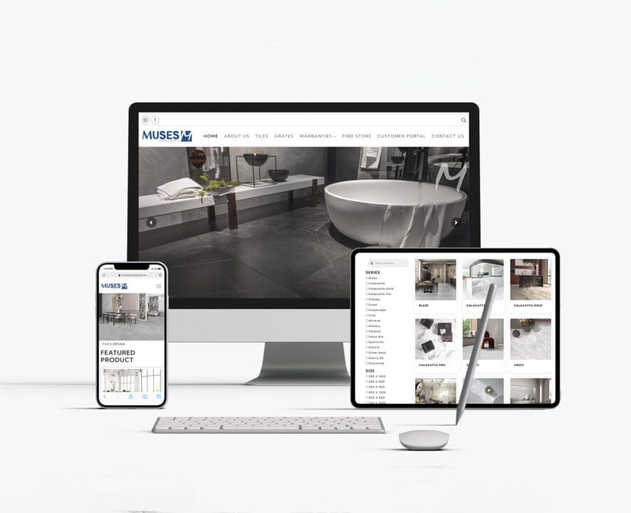
Muses Ceramic
We created a responsive website for Muses Ceramics that works well on computers, tablets, and phones. It beautifully showcases its porcelain tiles, making it a delightful experience for art and interior enthusiasts worldwide.

Binah Projects
Binah Projects' website exemplifies our ability to craft exceptional online platforms. Specialising in residential, mixed-use, and commercial developments, their site reflects our dedication to excellence in design and construction standards.
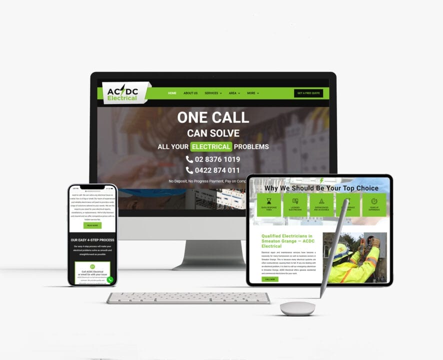
ACDC Electrical
The ACDC Electrical website stands as a shining example of our proficiency in web design. As a fast-growing local business, their site highlights our reliability and expertise in providing electrical solutions to professionals and homeowners nationwide.
A consultation with us is your ticket to Dream Realisation. Let's make it happen.
Phone
Sydney Neighborhoods