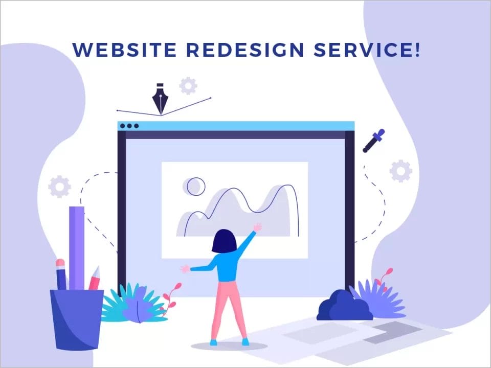
Which features will lead to better web design in 2024?
While web design has evolved over the years, there are some key features that make a website function better for its users. This article will explore what makes up a good web design and how these features can improve your site’s performance.
Fast load times
Fast load times are important for web design because users don’t want to wait for your page to load. If they’re trying to get information quickly, and your site takes too long to load, they’ll go somewhere else.
There are lots of ways you can make sure that this doesn’t happen:
- Make sure the content you’re serving up is as small as possible. The smaller the file size of your images and videos–and even CSS files–the faster your pages will load for visitors. Optimising these things takes some work but it’s worth it! * Use tools like Google PageSpeed Insights or GTmetrix (or both) to measure how fast or slow different parts of your site are loading so that you can identify which ones need improvement most urgently. Then use those insights when making changes; if something isn’t working right after making changes like optimising images and compressing stylesheets then try something else until everything loads perfectly smoothly!
Mobile responsiveness
This is a feature that many people overlook when they’re designing a website, but it’s important to note that mobile devices are increasingly used to browse the internet. The ability for your website to be viewed on all devices is essential if you want your website to reach as many people as possible.
Mobile responsive design makes it easier for users to find what they’re looking for and read content on their phones or tablets because everything will resize accordingly when viewed from different screen sizes.
Responsive design
Responsive design is a technique in which the layout of a website adapts to different screen sizes. This means that you don’t have to create multiple versions of your site for different devices, like smartphones, tablets and desktop computers; instead you can use responsive design techniques so that it works on any device without having to make any changes at all!
Responsive Web Design allows us as designers/developers more flexibility when designing for multiple devices and screen resolutions. We no longer need separate designs for mobile phones versus tablets or desktops; instead we can build one website that will work well across all platforms regardless if someone accesses our content through their phone or laptop computer!
Clean and simple layout
In the world of web design, a clean and simple layout is the best way to go. A good layout makes it easy for visitors to understand what your site is all about, how they can navigate through it and where they can find what they’re looking for. The more complicated or cluttered your website looks, the harder it will be for people who visit it.
A good idea is to start from scratch when designing your next website so that you can focus all of your attention on creating something new and exciting while still keeping things simple enough that users can easily navigate around on their own without needing help from an expert every step along their way through each page or section of content within those pages.
Scrollable content area
The scrollable content area is a great feature for web designers to incorporate into their designs. This feature allows users to see more information than they would be able to if the entire page was visible at once, and it’s easy to navigate with a mouse or touch screen.
The scrollable content area is also very easy for users who are browsing with a finger on their smartphone or tablet device, because they can simply tap where they want on-screen navigation buttons (such as back arrow) appear so they can go back one step in their viewing experience without having any trouble navigating through different pages of content.
A responsive home page that works well on any device, including mobile phones and tablets
Your home page is the first thing people see when they visit your website. It’s an important part of your brand identity and should reflect what you do and why people should use your services.
A responsive home page that works well on any device, including mobile phones and tablets is essential for any business wanting to make sure its customers have a positive experience whether they’re viewing it on their desktop computer or smartphone in the palm of their hand.
It should be easy for visitors to navigate around the site without having to zoom in or scroll horisontally across multiple pages just because there isn’t enough room on one screen!

Controllable font sizes makes it easy to read news stories no matter what device you’re using or what your vision capabilities are like
You might not think about it much, but font size can make or break your website. If the text looks too small and hard to read, people will just leave your site without bothering to look around. On the other hand, if you have large font sizes that are easy on the eyes and make sense with each other (like using a bolder version of an existing font), then people will stay longer because they have no trouble understanding what they’re reading.
To ensure that all visitors can access your content easily regardless of where they’re coming from or what device they’re using, there are some great options available:
Controllable Font Sizes – This feature allows users to change their preferred reading level by simply clicking on buttons at various points throughout the page’s design. It also gives them control over how much space each line takes up so that nothing feels cramped or crowded when viewed on smaller screens like smartphones’ screens!
These features all make a difference in the way people use your website, which makes it easier for them to find what they’re looking for and easier for them to want to come back again later
When you’re designing a website, there are several things that can make a big difference in how people use it. These features all make it easier for users to find what they’re looking for and easier for them to come back again later.
- Fast load times: When people visit your site on their phones or tablets, they’ll want the same experience as they would get if they were using a desktop computer. That means being able to access all of the content quickly without waiting around too long or getting frustrated with slow-loading pages or images that take forever to appear when scrolling down the page (or swiping through screens). You may think this isn’t important because most people will just come directly from Google searches and won’t browse around much anyway–but research shows otherwise! People often bounce off sites without buying anything if there’s too much lag time between clicks, especially when trying something new like ordering food delivery service through an app instead of calling someone up directly over the phone line like before.”
Conclusion
We hope this article has helped you understand the importance of web design, and how it can make a difference in how people use your website. You may also want to check out some other articles we’ve written on similar topics like: how to choose a logo designer who’s right for your business; what makes an effective brand identity?; and why should businesses invest in SEO?